
It’s not enough to simply have a visually appealing website in the fast-paced and competitive online realm. You must actively engage your visitors and guide them towards action to succeed. This is where the power of an effective call-to-action (CTA) design comes into play. A well-crafted CTA can captivate your audience, compelling them to take the desired action and significantly increase your conversion rates. The art of CTA design involves combining creativity, psychology, and user experience to create irresistible prompts that leave a lasting impact. It’s about more than just adding a button or link; it’s about strategically influencing your visitors’ behavior and nudging them in the right direction. Whether you want them to subscribe to your newsletter, download a resource, or make a purchase, the design of your CTA plays an important role in driving those conversions. In this article, we delve into the world of effective call-to-action design, exploring the key principles and strategies that can make your CTAs stand out from the crowd.
What is a Call-to-Action (CTA)?
A call-to-action (CTA) is a marketing term for any design to prompt an immediate response or encourage an immediate sale. A CTA most often refers to the use of words or phrases that can be incorporated into sales scripts, advertising messages, or web pages, which compel an audience to act in a specific way.
CTAs are strategically placed throughout websites, emails, advertisements, and various marketing materials to drive user engagement, and conversions ultimately, achieving specific objectives. These objectives can vary depending on the context and purpose, such as making a purchase, subscribing to a newsletter, downloading a resource, requesting a quote, signing up for a trial, or following on social media.
Tips for Designing Effective Call-to-Action (CTA)
- Use clear and concise language
Your CTA should be easy to understand at a glance. Avoid using jargon or technical terms that your visitors may not understand. For example, instead of saying “Learn more about our products,” you could say “Get started with our products today.”
- Use strong action verbs
The verb in your CTA should be strong and should encourage visitors to take action. For example, instead of saying “Click here,” you could say “Download now.” Strong action verbs can help to increase the click-through rate (CTR) of your CTA.
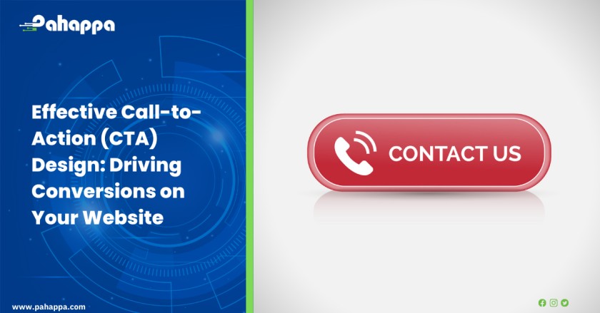
- Make your CTA button stand out
Your CTA button should stand out from the rest of your website content. You can do this by using a contrasting color, a larger font size, or a different shape. This will help to draw attention to your CTA and make it more likely that visitors will click on it.
- Place your CTA button in a prominent location
Your CTA button should be placed in a prominent location where visitors are likely to see it. For example, you could place your CTA at the top of your website, in the sidebar, or at the bottom of your blog posts. This will help to ensure that visitors see your CTA and are more likely to click on it.
- Test different variations of your CTA button
There is no one-size-fits-all CTA button. The best way to find out what works for your website is to test different variations of your CTA button. You can test different colors, fonts, and placements to see what gets the best results. This will help you to optimize your CTA and increase its effectiveness.
- Use persuasive copywriting techniques
Your CTA copy should be persuasive and encourage visitors to take action. Use words like “free,” “limited time,” and “exclusive” to create a sense of urgency. This will help to convince visitors that they should take action now.
- Personalize your CTAs
If you know your visitors’ names, use them in your CTAs. This will make your CTAs more personal and increase the chances that visitors will click on them. For example, you could say “John, get started with our products today.”
- Track your results
Once you have implemented your CTAs, track your results to see how they are performing. This will help you determine which CTAs are most effective and make necessary adjustments. You can track your results using Google Analytics or another web analytics tool.
How an Effective Call-to-Action (CTA) Design Aids in Driving Conversions on Your Website
- Clear Direction
A well-designed CTA provides clear direction to users, telling them what action to take next. It eliminates confusion and helps users understand their next step, whether it’s making a purchase, subscribing to a newsletter, or signing up for a service. By removing barriers and guiding users through the conversion process, CTAs increase the likelihood of users following through.
- Attention and Focus
CTAs are designed to stand out and capture users’ attention. With visually distinct elements, such as contrasting colors, compelling copy, and prominent placement, CTAs draw users’ eyes and focus their attention on the desired action. By grabbing attention, CTAs increase the chances of users engaging with them and moving further into the conversion funnel.
- Persuasion and Urgency
Effective CTA designs leverage persuasive techniques to create a sense of urgency and motivate users to act immediately. Techniques like using action-oriented language, incorporating time-limited offers, or showcasing limited availability create a fear of missing out (FOMO) and encourage users to convert promptly. By instilling a sense of urgency, CTAs prompt users to overcome hesitation and take action.
- Trust and Confidence
Trust signals and reassurances can be integrated into the CTA design to build user confidence and overcome objections. Including elements like security badges, customer testimonials, or money-back guarantees near the CTA instills trust and alleviates concerns users may have, increasing their willingness to convert.
- Responsive Design
With the rise of mobile browsing, an effective CTA design ensures responsiveness across different devices and screen sizes. CTAs that are optimized for mobile devices, with easy-to-tap buttons and clear visibility, provide a seamless experience for mobile users. By accommodating various devices, CTAs reach a wider audience and facilitate conversions across different platforms.
- Aesthetic Appeal
Aesthetically pleasing CTAs enhance user experience and make the conversion process more enjoyable. Attention to visual design, such as appealing color schemes, typography, and graphics, creates a positive impression and increases the likelihood of user engagement. Well-designed CTAs make users more inclined to interact with them, leading to higher conversion rates.
A visually appealing website alone is not enough. It is the strategic implementation of effective CTAs that actively engages visitors and leads them towards conversion. Contact us today for a website with effective CTAs