
Color is an essential aspect of mobile app design that can have a significant impact on the user experience. From conveying emotion to guiding users through the app’s interface, the right color choices can make or break an app’s success. In this article, we will explore the importance of color in mobile app design and factors to consider when choosing a color for your mobile app.
What does Color in Mobile App Design mean?
The use of color to produce a visually appealing and unified design for mobile applications is known as “color in mobile app design.” It involves choosing the right color palette and color scheme and applying them to various app elements, including buttons, text, backgrounds, icons, and more. The user’s experience and the app’s overall appearance and feel can both be influenced by the use of color.
Importance of Color in Mobile App Design
Establish Brand Identity
Color is a key component in creating a brand identity. An app can stand out in a competitive market by using a well-designed color scheme that complements the brand’s entire color palette. This is so because some brands’ colors can evoke certain emotions and memories. For example, social media platforms like Facebook, Twitter, and LinkedIn frequently employ the color blue to create a sense of trustworthiness and professionalism.
Convey Information
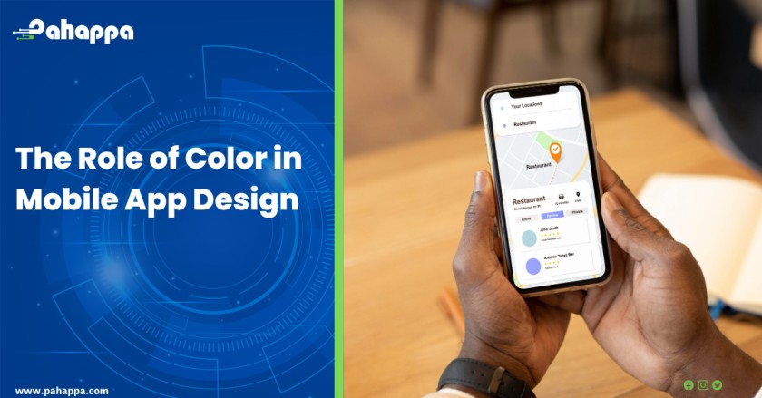
By using distinct colors to differentiate between various app elements, such as buttons, text, or icons, users will be able to more easily identify them. To illustrate the primary action that a user should do, primary and secondary buttons may have different colors. Users may more quickly understand the functions of the various app elements by using colors consistently, which makes it simpler for them to navigate the app.
Create a Sense of Hierarchy
The use of color can help users find important information by creating a sense of hierarchy. Designers can draw attention to and emphasize the most critical elements of an app by giving them a different color. For example, the color red is often used to indicate errors or warnings, drawing users’ attention to important messages or actions they need to take.
Evoke Emotions
Color has the ability to strongly influence the emotions and mood of a user. Designers can make use of the different emotional responses that various colors might evoke to produce a more engaging user experience. For instance, using red and orange as the background of an app can evoke a sense of urgency or excitement, while using blue and green can convey a sense of peace and trustworthiness.
Improve Accessibility
for users with visual impairments, high-contrast colors are essential since they make it simpler for them to read and navigate the app. The use of colors with high contrast can improve the overall accessibility of the app, making it easier for all users to engage with it. In addition to high contrast, designers also need to consider the readability of text on different backgrounds and ensure that the colors used are accessible for users with color blindness.
Factors to consider when choosing the right color for your Mobile App
Target audience
Consider the target audience for your app. Age, gender, and culture all affect people’s preferences for colors. For example, younger users tend to prefer brighter colors, while older users tend to prefer more muted, classic colors. Additionally, different cultures may have different associations with colors, so it’s important to consider this when designing for a global audience.
Brand identity
To ensure consistency throughout all marketing materials, your app’s color scheme should match your brand identity. This applies to your website, logo, and all other marketing materials. A color scheme that goes well with your brand’s identity can help people remember your app and boost brand recognition.
Color psychology
As colors can influence users psychologically, it’s essential to choose colors that support the goals of your app. Red, for example, is frequently linked to passion and excitement, while blue is connected to reliability and trust. Choosing colors that trigger the desired emotional response is vital since different colors can also affect a user’s mood.
Contrast and readability
Choosing colors that have enough contrast is essential for making text and other important elements readable. Colors that are too similar can make it difficult for users to read or interact with your app, especially for users with visual impairments. It’s also important to ensure that your color scheme is accessible for users with color blindness, which affects about 1 in 12 men and 1 in 200 women.
Current trends
Keeping up with the most recent color trends will help your app feel up-to-date and effective. However, you don’t want to be too trendy, as this can make your app feel dated quickly. Instead, consider incorporating current trends into a timeless color scheme.
Platform and device
Different devices and platforms can display colors differently, so it’s important to test your color scheme across multiple devices and platforms to ensure consistency. You also want to make sure your colors look good on smaller screens and are easy to see and interact with. Additionally, you may want to consider adapting your color scheme for dark mode, which is becoming more popular on mobile devices.
Color can set the tone for the user experience, help create an emotional connection with the user, and guide them through the app’s interface. With careful consideration and attention to detail, mobile app developers can create a color scheme that not only looks great but also enhances the user experience. Reach us today for professional mobile app development services